RASI without tears: how we helped a sleepless consultant avoid hours wasted in Excel and PowerPoint
How to do RASI and avoid the pain of Excel and Powerpoint.
The situation
We had a call last week from a young business analyst – let’s call him Xavier – in a major consulting firm. He was in his second month in the firm, just out of business school, working in South America.
His new project was for one of his firm’s largest clients. The Principal in charge of the client relationship had decided to give the client a RASI matrix as a freebie.
What activities the business needed to do, versus who, in the business or its suppliers, was responsible for what. The analysis should open up many new questions – who should be responsible, how large the spend was across organizations, whether the business was strategically exposed, how it could be re-balanced. The RASI analysis would be a common reference point visualising what people do.
Xavier was asked to map it. The only issue was, he had never been trained in a method for doing the RASI. At business school, they’d referenced all kinds of high level versions – RACI, RASCI, RASIC, RECI.
But he only knew Excel, Access and PowerPoint. So how to do a RACI? What tools could he use? And what happened if things changed, because Xavier had a feeling they would…
The method
The Principal gave him an Excel sheet listing the activities of the company. In this, RASI would be called RECI (responsible / execute / communicate / inform).
“We divided it up into 10 links in the value chain. Then divided those into about 6 macro processes each. Then divided that into activities, so we ended up with 294 activities. We changed “A” to “E” for ‘execute’ and put the RECI on the spreadsheet next to them…”
“We then went about linking the areas – e.g. business development, legal, operations, procurement, logistics and so on. There were about 65 areas altogether. Some inside and some outside the company.”
The complication
“When we were pretty far along, we started to put them onto PowerPoint, but sure enough we found that there were changes in who was responsible for what. So we are having to add more rows into all the Excel sheets and re-do all the PowerPoints. At the start it was faster to do it in Excel, but now we’ve got 2 weeks to go and we’re concerned about delivery. We are thinking that it might be good to get a better RECI tool.”
The question
“I was surfing Google, trying to find ‘RASI chart / Excel / PowerPoint RASI’”
The resolution
Xavier gave us a call. We listened. We’d been there, and we knew the experience. So we talked Xavier through some practical issues with RASI: it’s valuable at a time of strategic planning or periodic review. It lets you see who is going to deliver what, and it helps you take care of the orphans.
But because the world keeps changing, some key recommendations:
- Do less. Do you really need to map 4 factors? Is ‘C’ Communicate really different from ‘I’ Inform? In another version, is ‘A’ Accountable really different from ‘R’ Responsible? What if you just started with one: ‘R’?
- Use reliable tools. Otherwise, when things change, you’ll be re-writing the Excel sheet and re-drawing the PowerPoint slides until the project eventually expires with exhaustion.
- Visualize. Because people have to see what they’re responsible for.
- Keep it up to date. Update periodically as responsibilities change.
And that’s where we got to with Xavier.
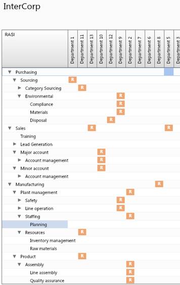
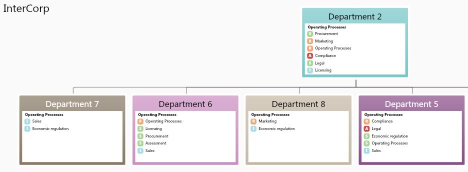
One simple map in Orgvue. Visualized in organization diagrams. Exportable to Excel and PowerPoint. And automatically up to date if extra rows and responsibilities were added, or people and departments moved.
Here was one visualization:
We’re still in touch with Xavier now. We’ve yet to hear the client reaction. But we do know that Xavier has got a tool that helps him make sense of RASI and get his sleep back. And if that helps the Principal deliver a better solution to the client, that has to be a good thing.

